Affiliate Landing Page Checklist: From Promise to Purchase Check
Review an affiliate landing page for message match, evidence, disclosure, mobile usability, purchase checks, and clear outbound calls to action.
An affiliate landing page should connect a visitor’s reason for clicking with enough information to make the next decision. That decision may be to read a comparison, check a seller’s details, or decide the product is unsuitable. A striking design cannot compensate for missing compatibility information or an unclear commercial relationship. Use a checklist that examines the whole journey, from the headline to the destination of the final button.
Match the promise that brought the visitor
Read the referring article, social post, or advertisement beside the page headline. They should describe the same offer and audience. If the post promises a setup guide, do not send the visitor to a page that only repeats a product slogan. State who the page is for and what it helps evaluate in the first screen.
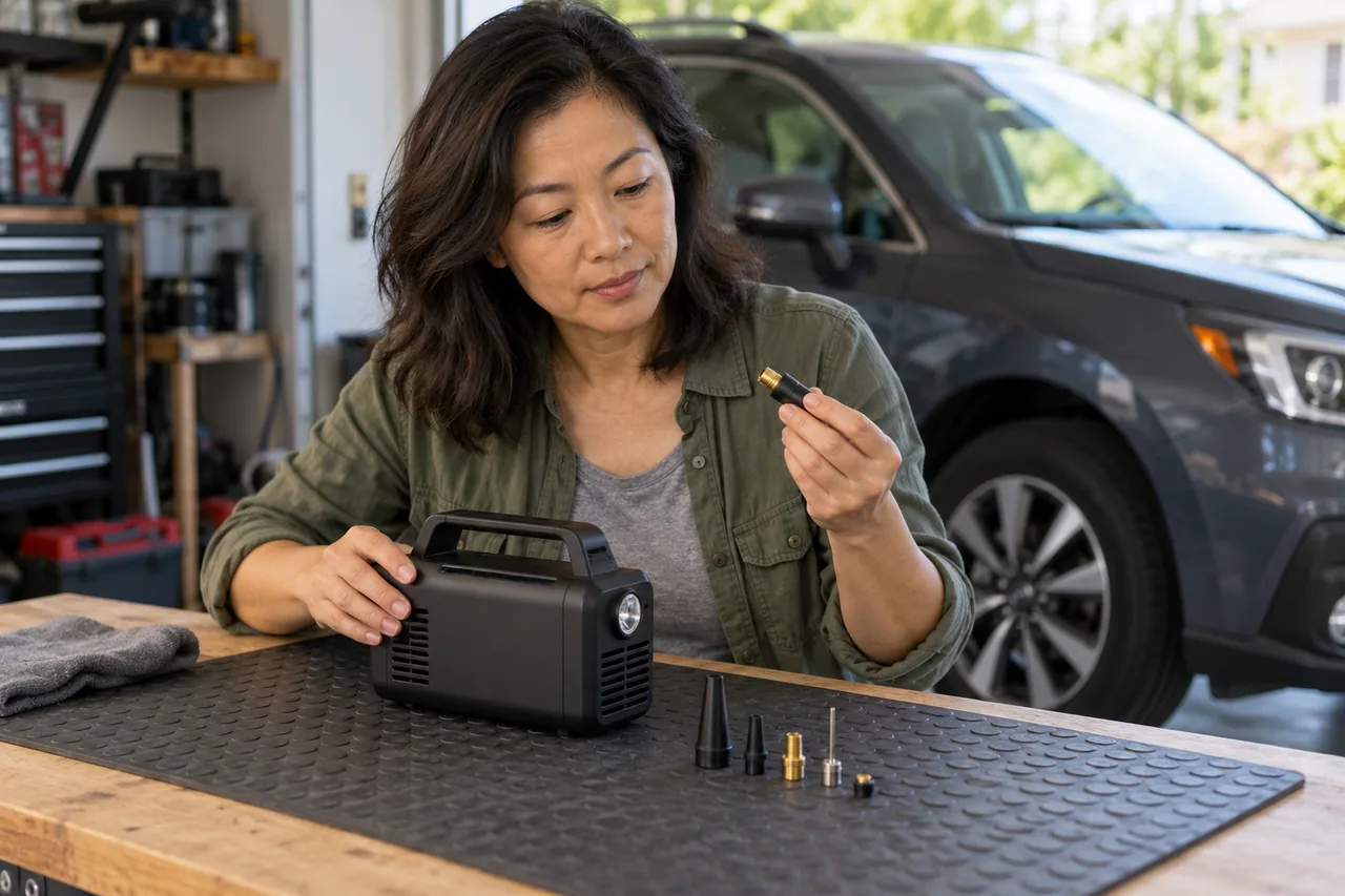
Include a short explanation of the problem, the important decision criteria, and the basis of your recommendation. Avoid unsupported superlatives. If the page uses a fictional example or illustrative image, label it appropriately. Neither a generated customer portrait nor a staged product image proves that a real customer achieved a result.
Make evidence and limitations easy to find
Provide a compact suitability summary with requirements and tradeoffs. A reader should be able to determine whether their vehicle, device, region, or workflow matches the offer. Link to official details for information you cannot maintain confidently. Put your commercial relationship disclosure near the relevant recommendation and before the outbound action.
Use images that add information: an authorized product photograph, a diagram of the setup, or a clear interface illustration. Write useful alternative text and reserve space for the image so the layout remains readable while it loads. Remove decorative assets that make the page heavier without helping the decision.
Worked example: a portable equipment page
Suppose a hypothetical automotive publisher builds a landing page for a portable inflator. The headline introduces its intended task rather than promising universal emergency protection. The body asks readers to check supported use, power source, storage size, and manufacturer instructions. A simple illustration explains the setup sequence without depicting an actual test.
The button says “Check current product details” and opens the intended seller page. The editor tests that destination, including the exact variant. The page does not invent a discount or display a fake stock counter. A separate guide explains general selection criteria for visitors who are still comparing alternatives.
Test the page as a visitor
Open it on a small screen. Check headline wrapping, readable text, navigation, image visibility, and button spacing. Verify that the page works without asking someone to create an account merely to read the promised information. Google’s people-first guidance emphasizes a satisfying experience; use that principle to remove friction that serves no reader purpose.
Track meaningful actions such as a guide visit or qualified outbound click, while keeping analytics and commercial reports distinct. A click does not prove a sale. Review visitor questions to identify missing information and make one reasoned improvement at a time. This helps you learn which changes solve a problem instead of attributing every fluctuation to the latest color or headline.
Frequently asked questions
How many call-to-action buttons should I include?
Place them where a reader has enough context to act. Repeating a button can help on a longer page, but every placement should have a clear purpose.
Should I copy the seller’s product description?
Build your own decision-focused explanation and verify factual claims. A landing page should add useful context instead of reproducing the seller’s wording.
Sources and further reading
Program features, eligibility and terms can change. Check the official documentation before applying or promoting an offer. Examples in this guide are illustrative.
Put the next step into practice
Explore the free LinkRush campaign planner or continue learning below. Planning tools save your work in your browser.
Explore the workspace →